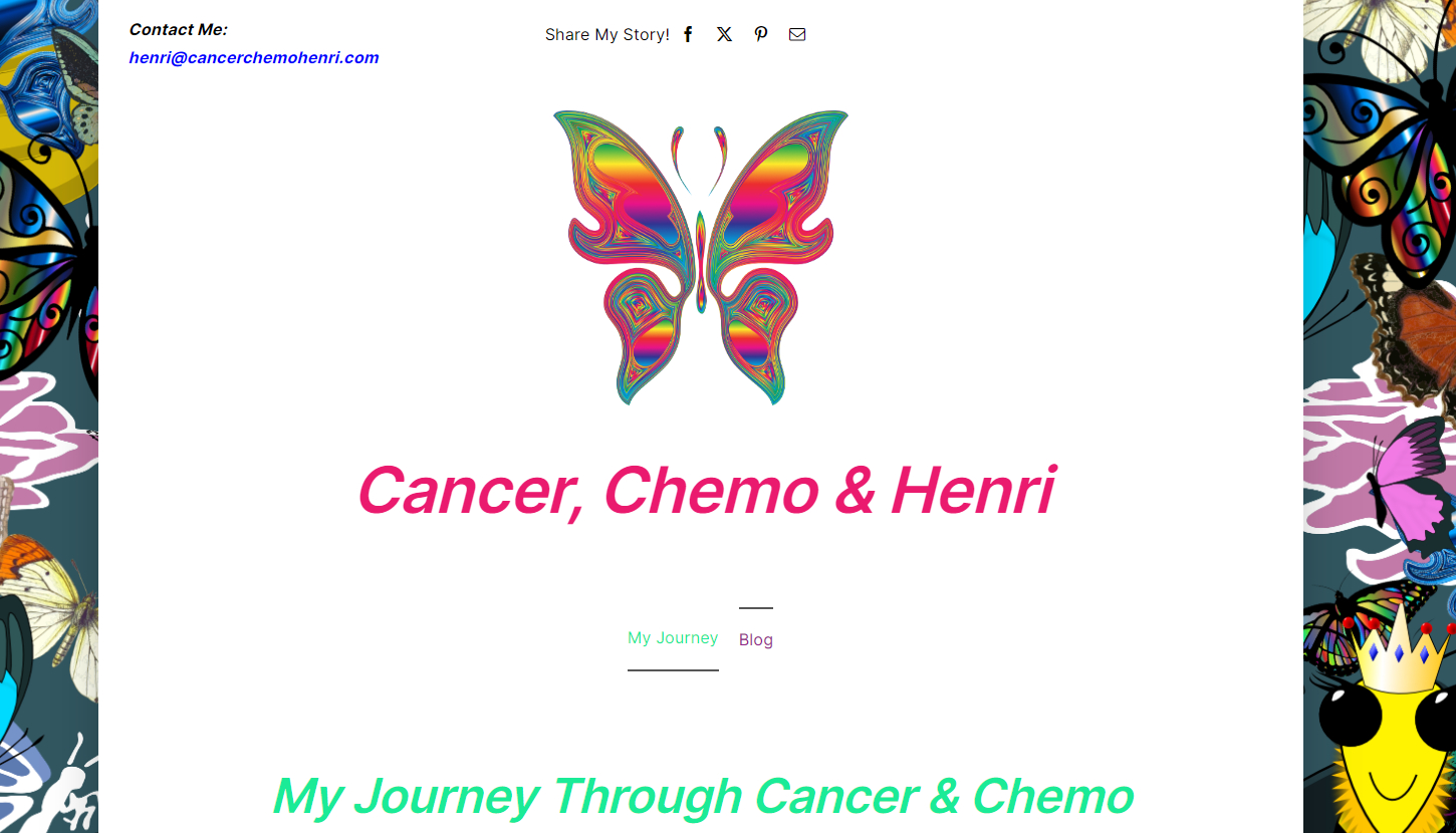
Cancer Chemo & Henri stands as a testament to my commitment to creating elegant and meaningful personal blogs, and in this instance, I chose WordPress as the platform of choice. My design philosophy centers on simplicity, and for this website, I opted for a clean layout, utilizing only the homepage and the blogging platform to convey the content. The unique touch comes from the background graphics I crafted, responding to the client’s request for an uplifting ambiance – a delicate blend of butterflies and bees dancing harmoniously in the digital backdrop.
In the realm of design, typography plays a pivotal role in capturing the essence of a website. Crafting headlines and body copy involves meticulously selecting fonts, sizes, and spacing to enhance readability and visual appeal. The thoughtful use of typography communicates the content effectively and contributes to the overall aesthetic. It’s a delicate balance, ensuring the text complements the visual elements, guiding the reader through the narrative. Additionally, I skillfully designed the logo and favicon, integral components of brand identity, adding a personalized touch to Cancer Chemo & Henri.
Head on over to Henri’s Blog and look around!

